An Insight into Biyo Point of Sales Dashboard

Support Team
Last Update 7 bulan yang lalu
Dashboard
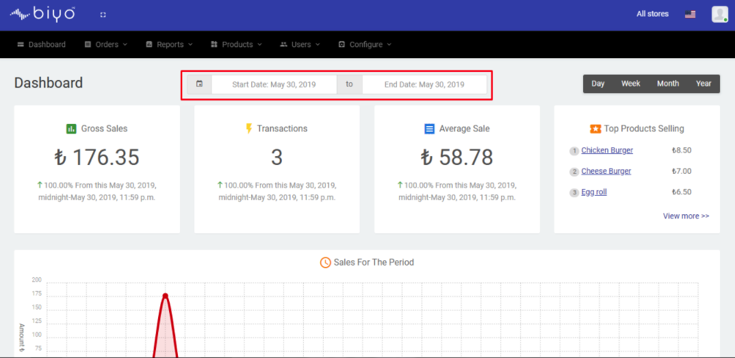
As soon as the user is logged into the Biyo web application, the Biyo Web Dashboard is displayed. The Dashboard gives a glimpse of the Gross Sales, Transactions, Average Sale and details about top products that are selling for the selected date range. By default, the dashboard displays the details of the last 24 hours starting from the current time.
Steps to View Dashboard results for the last 24 hours:
1. Log into the Biyo web application using your login credentials.
2. Dashboard will automatically display the sales details for the last 24 hours starting from the current system time.
Custom Date Range:
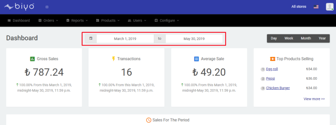
The user is able to change the date range if he wishes to view the results for a longer period of time. The user can select a Start Date and End Date and based on the date range selected, the results are updated.
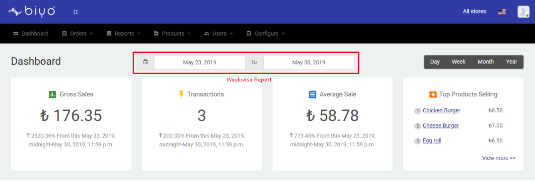
The Day, Week, Month and Year buttons at the extreme right on the Dashboard enables the user to view the results for today, the current week, current month and current year respectively. For example, to view the result for the current week, click on the “Week” button. The date pickers will automatically be filled with the dates of the current week.
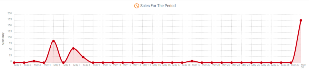
Sales for the Period Graph
Sales Period Graph shows the sales done for the day by total sales amount for the selected date range. With the help of these graph, user can easily figure out during which days of the week/month sales were up and during which days sales were down.
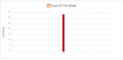
Days of the Week Graph
Days of the Week Graph is another useful pictorial representation that is present in the dashboard which allows the user to know during which day of the week sales very high and during which day sales were less.
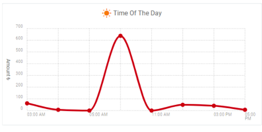
Time of the Day Graph
As a user, if you wish to know at what time maximum sales is and at what time sales are down, you can get the details from Time of the Day graph. It gives the user a pictorial representation of the sales for the day.
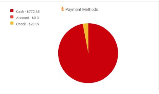
Payments Method Graph
Most business owners would love to get an idea about the different payment methods used by customers and what is the most popular among them. With the help of Payments Method pie chart in Biyo Dashboard, user will get a clear idea about the different payment methods used by the customers.
Top Categories Selling Graph
In case the user want to check out the categories that bring in the maximum percentage of sales, he can see that in the Top Categories Selling graph present in the dashboard. The top categories selling graph shows the item and the total sales amount for that particular item.
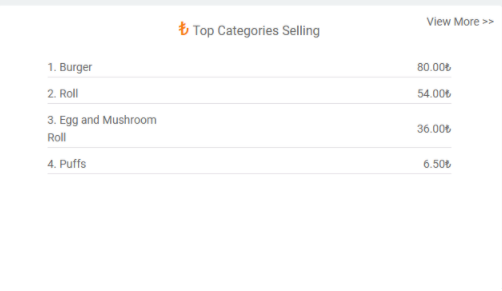
By clicking on “View More” link, Category Summary report is opened that shows list of the categories sold for the selected time frame.